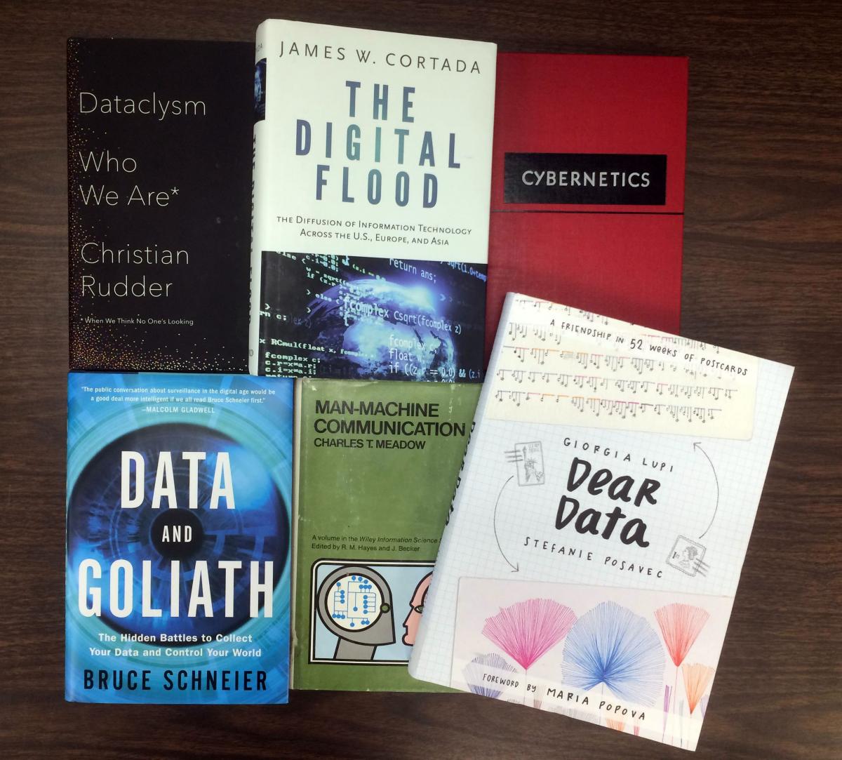
Have you ever indulged yourself in a moment of déjà vu? Recently while visiting the Museum of Modern Art, a book cover caught my eye and gave me pause: I knew I had seen it somewhere before. Upon my return to Hagley, I confirmed that Dear Data is a new addition to our Library, cataloged last month by a volunteer who is helping us process the James W. Cortada Collection of Information Technology Publications.
News of this accession was announced last summer, and to date we have cataloged about 1,500 of the estimated 5,000 titles. Encompassing all aspects of the computer industry, topics range from early systems with punched cards to the ascent of “big data” with high volume, variety and velocity. Dear Data distinguishes itself as a proponent of the “slow data” movement. Its mission is akin to the cultural phenomenon that has emerged in recent years for a more intentional approach to the way we handle such things as food, flowers, fashion, medicine, and travel.
Dear Data documents the year-long, trans-Atlantic postal correspondence that began in 2014 between two visual information designers, Giorgia Lupi and Stefanie Posavec. Every week they chose a different theme on which to collect personal data, such as checking the time of day or trying out new things. After organizing their facts, they each depicted them in a hand-drawn graph on the front side of a postcard. The flip side offers a key to decode the image, alongside the requisite snail mail address and postage. By the end of 2016, the authors announced that their casual exploration had led to outcomes they never anticipated: publication of the book, accolades through exhibits and awards, and ultimately the acquisition of their archive as part of the MOMA permanent collection.
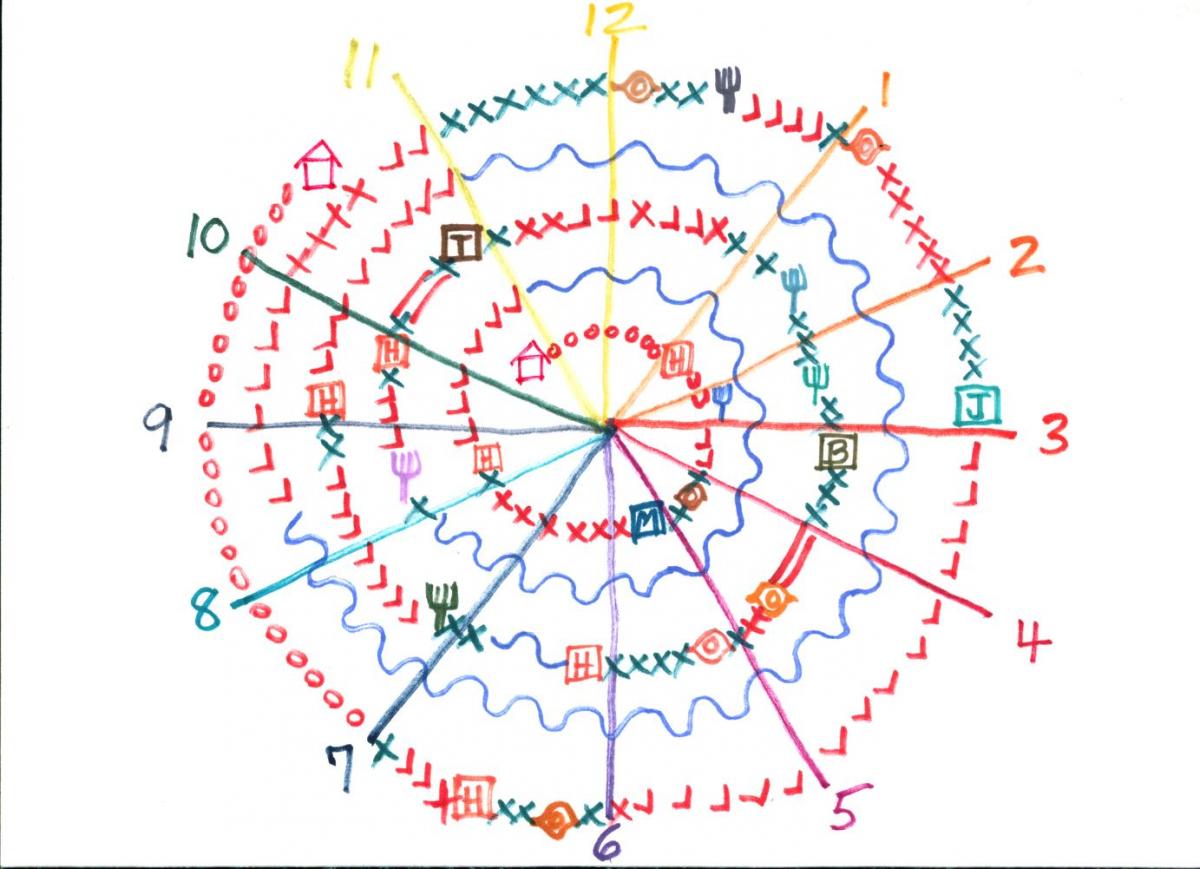
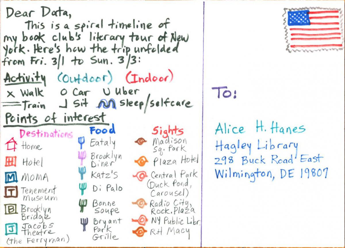
Links embedded above will take you to the exchange between Lupi and Posavec. The illustrations below are my own creation. Inspired by their communication, I analyzed the details of my recent trip to New York. Celebrating our ten year anniversary, my book club connected with as many literary landmarks as we could fit into three days and two nights. Working with our data, I conceived a spiral timeline to represent the unfolding of our fabulous weekend. The course of events follows a path marked by six modes of activity, color-coded by location. Points of interest appear as destinations, eateries, and sights. I find that engaging with data in this deliberate fashion to create a pictorial record makes for a fascinating journey of its own! Cortada may have claimed that “I’m not collecting fine art, I’m collecting the story of computing.” But taking a break with Dear Data suggests that they may be one and the same.
Alice Hanes is the Technical Services Librarian at Hagley Museum and Library.