At the turn of the twentieth century, the modern magazine was taking shape, and printers, publishers, illustrators, and advertisers were playing around with new styles and techniques for capturing their readers’ attention. In this episode, Jennifer Greenhill explores how artists incorporated insights from psychology and advertising into their designs and page layouts. Using blank space, typography, and color, they helped establish a modern aesthetic of magazine illustration and design that was intimately connected to the world of advertising.
Related Collections
Curtis Publishing Company, Two Pages Facing: Some Suggestions for Advertising Display (1916)
Curtis Publishing Company, Two Pages Facing in the Ladies’ Home Journal (1921)
Printers’ Ink
The Inland Printer
Curtis Paper Company Records
Curtis Publishing Company Records
Art Director’s Annual
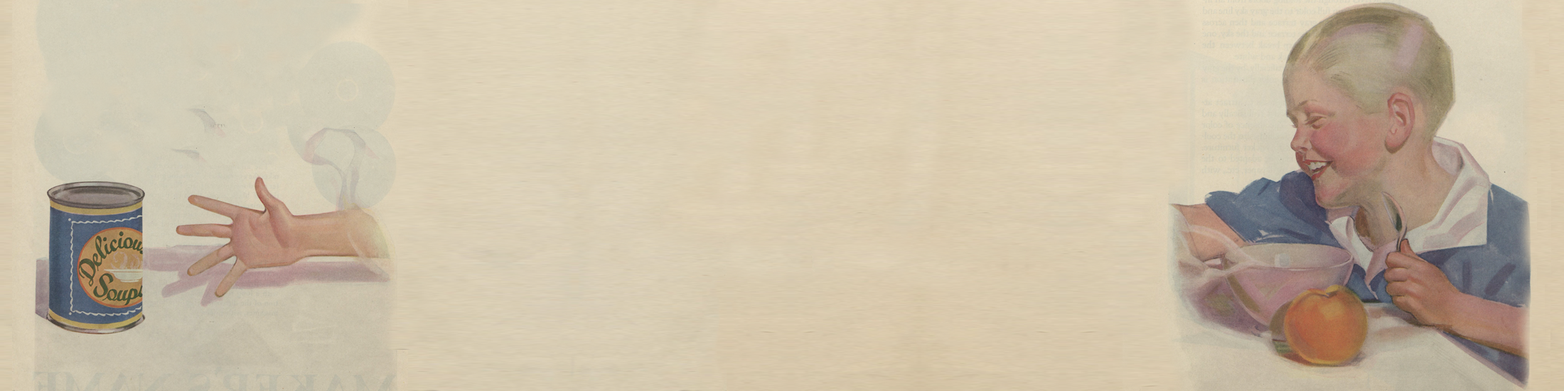
Banner image: Ladies Home Journal (1921), Hagley Digital Archives
Jennifer Greenhill is associate professor of art history at the University of Southern California. She is the author of Playing it Straight: Art and Humor in the Gilded Age. She was a 2017–2018 NEH-Hagley Fellow in Business, Culture, and Society.